Showing posts with label Taylor Guerra. Show all posts
Friday, April 5, 2013
Hi-Fructose magazine: Resist
Maybe you like it maybe you don't, I do this is for certain. I enjoy the type treatment for the article title "Alex Gross" with its ornate 1960s vintage vibe with teardrop scroll terminals, yum. It almost looks like a logo or branding, could be. I Also enjoy the pairing of the bright blue colored logo-esc name next to the super saturated illustration/painting of the girl drinking a beverage. How very appealing that it is displayed next to a grotesque sans serif widely set modern typeface on the opposite page. Furthermore, i do enjoy the pairing of the super ornate title and the compact text below, very contemporary and daring pull-quote/1st paragraph. I enjoy the fact that the rest of the body copy is in a roman sans serif typeface and in a smaller size so after the reader has been jazzed up and pulled in, can settle in and enjoy reading this article. Interesting composition and placement as well...I cant help but look and like. I will keep these ideas in mind and would like to experiment with this technique in the future.
Monday, March 25, 2013
Parts of an Exhibition Catalog
The parts of an exhibition catalog vary from book to book, but not so much that there isn't a definite pattern of what belongs in one. We grouped each part into one of three sections based on where it normally appeared in the books we looked at. The front matter is first and precedes the main content; both are followed up by the back matter.
Front Matter
- Cover/Dust Jacket/French Flap
- Blank page
- Title page
- Book curator
- Authors
- Designers
- Exhibition title (shared with book).
- Publication Information
- Table of Contents
- Sponsors/Lenders to Exhibition
- Foreword
Main Matter
- Essays
- Picture/Plates
Back Matter
- Notes
- Bibliography
- Exhibition Checklist
- Section pages/Divider
- Chronology
- Index
The order of each part wasn't always in that exact location, but it was reliably in the section provided.
Friday, March 22, 2013
Nick Cave: Meet me at the Center of the Earth
I enjoy the weaving of type into the text and layering textures & photos under the text blocks these techniques illustrate the way Nick Cave assembles his sculptures and works with fabrics.
Sunday, February 24, 2013
Chocography: Typography Can be sweet
I love food and typography, apparently so does Rosa De Jong in Amsterdam. Who knew chocolate and typography were a great match made in baking heaven? Chocolate plus helvetica says love, peace, neutrality, and delicious to me. When i came across this i immediately wanted to know how i could get my hands on some chocolate letters, whether it be by making some myself or ordering some. This definitely and audaciously serves as inspiration to look and think outside of the typographic box and explore all elements of life in discovering new ways of creating a message in typography.
Typefaces used: Helvetica, Rockwell & Baskerville.
Medium: Chocolate
Thanks Rosa!
http://www.behance.net/gallery/CHOCOGRAPHY/6257491
Sunday, February 17, 2013
Salvador Dali Museum St.Petersberg,Florida
I love this Museum Guide that Paul on Behance made. It was for a project during his senior year at the University of North Texas. This past summer, i was given the opportunity to go to the Dali Museum in St.Petersberg Florida. I flew out there and my mind was blown by the architecture and the face that museum was on beachfront property. Being one of the most beautiful and stunning buildings i expected the interior design, graphic design and marketing to be fitting with his work and the building. I was a little disappointed in the graphic design, t the museum guide was okay but the overall Dali experience was amazing. I wish that the graphic design would have aligned with the feeling you get experience being at the museum. In Paul's design i get the feeling of the experience of the museum and more. So even though it isn't the Dali Museum's official guide I would like to present you with this great design.
http://www.behance.net/paulsamples/frame/1375969
Sunday, February 10, 2013
Alice in Wonderland printed in 1946
Alice in Wonderland And Through The Looking Glass
by Lewis Carroll Illustrated By John TennielGrosset & Dunlap, Publishers 1946.
This is one of my childhood favorites and i wondered why i loved it so much besides the reason that the story is lovely. I love the Typography, the inset and margin illustrations. Especially the Initial letters, i'm not sure if they are hand lettered or not but they sure look like it. About the body text, i recognize the use of em dashes and modern typeface. The typeface is set quite a bit larger for children's reading, which emphasis throughout the text in bold letters or all caps. To keep the child's mind interested, there are illustrations in the margin with visual queues which are really detailed line drawings/etchings. This book & story has always been and will continue to be an influence on my work.
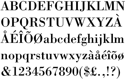
I think the choice of typeface for the body text is a cut of Bodoni, a modern font with extreme thicks, thins and thin straight serifs.
Sunday, February 3, 2013
Moonrise Kingdom & Jessica Hische
Moonrise Kingdom & Jessica Hische a match made in heaven. First of all every time i see one of Jessica Hische's typographic designs it makes me want to learn to hand-letter and/or make fonts, definitely inspiring.When i saw the movie i was taken aback by the use of a script typeface for the movie opening credits but i came to terms with the fact that i actually love it. I thought there was a rule against using fancy-scriptlike typefaces for body text or things you actually have to read through and understand. I like to read all of the credits to movies and i want it to be easy to read—yes i am a nerd like that. Anyway, i found this in CA-Communication Arts Magazine. Enjoy.
"I can happily release it as a commercial typeface a year after the movie’s release, which should give me some time to add in even more fun features than are already there."
-Jessica Hische interviewed by Darren Booth of Design Envy
Jessica Hische, Letterer http://jessicahische.is
Wes Anderson, Art Director
Moonrise LLC, Client http://www.moonrisekingdom.com
Darren Booth, Design Envy http://designenvy.aiga.org/moonrise-kingdom-titles-and-credits-jessica-hische/
Sunday, January 27, 2013
Alamo Drafthouse and The Princess Bride Wine Collaboration by Helms Workshop
Every year, the Helms Workshop creates a new design for the Alamo Drafthouse Cinema’s wine collection always with a movie in mind—this time The Princess Bride. I love the illustration of the movie through its typographic appeal and branding. The Princess Bride is one of my favorite movies, we go way back, its a tradition to for my family to watch it together and quote-along (is this dash in the right place?). I saw the branding campaign in use a few months ago at the Alamo Drafthouse in Austin and fell in love with this work by Helms Workshop.
The use of a sans serif typeface, the application of hierarchy and color are beautifully combined to make the quotes translate with the voice of the movie's characters and the branding pop. The bright colors, the typography and iconography all illustrate the happenings within the movie wonderfully and are translated into a visually appealing product line—of wine, t-shirts and memorabilia for movie lovers. This example of great typography and branding help me further understand the value of great design and definitely has made an impact on my design ides.
Helms Workshop - The Princess Bride Custom wine packaging system
Tuesday, January 22, 2013
edible AUSTIN
UPDATE: I just received an email from Jenna at edibleAustin. She informed me the typeface that they use is named "Trade Gothic". :)
Edible Austin is an easy, delicious, and enjoyable read, where the design is invisible. A clean, fresh, and understated design approach to a localized food magazine with info for foodies, sustainability peeps, and people that like to eat good local food! It has great articles on places to eat, recipes to make and markets to go to that are farm fresh and from the austin(and closely surrounding) area. Edible Austin has contemporary feel and uses a few different typefaces.
I chose to do my research on the typeface that they use for the table of contents, the headlines, sub headlines, and display text. I believe they use News Gothic.
Edible Austin is an easy, delicious, and enjoyable read, where the design is invisible. A clean, fresh, and understated design approach to a localized food magazine with info for foodies, sustainability peeps, and people that like to eat good local food! It has great articles on places to eat, recipes to make and markets to go to that are farm fresh and from the austin(and closely surrounding) area. Edible Austin has contemporary feel and uses a few different typefaces.
I chose to do my research on the typeface that they use for the table of contents, the headlines, sub headlines, and display text. I believe they use News Gothic.
News Gothic is a realist sans serif typeface by Morris Fuller Benton 1909. It has organic shapes, subtle transitions, slightly slanted terminals, a simple & thinner stroke, organic & reduced to essentials. I enjoy looking at the headlines and subheadlines in News Gothic, however for the body copy is presented in a typeface with serifs. I'm glad they used serifs, I find it much easier to read due to more information forming the letters.
The Table of Contents in news gothic with a nice display of hierarchy. When you squint you can really see the hierarchy in that there is a nice gradation from dark to light, which is also important to less important. I see what you did there edible austin, and i like.
Tuesday, January 15, 2013
Codex: The Journal of Typography: Luca Barcellona
I have chosen a Calligraphic form of typography. It is not a font or a typeface in this formulation, it is handwritten lettering. The example below is from an article in Codex entitled Calligraphy: The Rhythm of Ink. Issue 01/ Spring 2011
Hand scribed lettering is an ancient art and those whom master it are truly dedicated and i admire that. Look at those swashes, especially the one on the R it is really out there! I am a huge fan of swashes and hand wonderfully crafted hand lettering. It is such a lost skill and with our society all turned our attention to the computer, it's even a task to handwrite at all.
I feel that it is very important to recognize that there are other ways to design and place type than on the computer and try to learn and fill my (our) toolbox with a broad range of skills. Admiration and curiosity is why i have chosen to take a moment for Luca Barcellona's piece(s).
His beautiful use of calligraphy has inspired me to try my hand at it. In the article Luca mentions that he strongly recommends to learn from a master in calligraphy and not to go
about it on your own if you want to learn well.
"As i said before, of course it is not useful to learn calligraphy by yourself. I don't have a definitive suggestion about it except the best way is always the hardest!" Luca Barcellona
Hmm well, i don't know a master. Maybe i'll try it and follow a master on youtube!
Also, I find it interesting that the title of the article and the cover of CODEX pairs a grotesque typeface and calligraphy.The calligraphy works well as a visual queue and instantly communicates what the article is about and thats just really cool.
Hand scribed lettering is an ancient art and those whom master it are truly dedicated and i admire that. Look at those swashes, especially the one on the R it is really out there! I am a huge fan of swashes and hand wonderfully crafted hand lettering. It is such a lost skill and with our society all turned our attention to the computer, it's even a task to handwrite at all.
I feel that it is very important to recognize that there are other ways to design and place type than on the computer and try to learn and fill my (our) toolbox with a broad range of skills. Admiration and curiosity is why i have chosen to take a moment for Luca Barcellona's piece(s).
His beautiful use of calligraphy has inspired me to try my hand at it. In the article Luca mentions that he strongly recommends to learn from a master in calligraphy and not to go
about it on your own if you want to learn well.
"As i said before, of course it is not useful to learn calligraphy by yourself. I don't have a definitive suggestion about it except the best way is always the hardest!" Luca Barcellona
Hmm well, i don't know a master. Maybe i'll try it and follow a master on youtube!
Also, I find it interesting that the title of the article and the cover of CODEX pairs a grotesque typeface and calligraphy.The calligraphy works well as a visual queue and instantly communicates what the article is about and thats just really cool.
Subscribe to:
Posts (Atom)