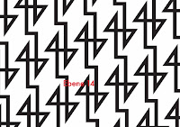
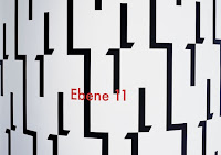
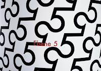
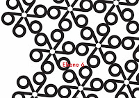
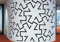
These walls were designed to distinguish each of the 19 floors of the Landesbank Baden-Wurttemberg an German bank and major international business. According to the website, the building's interior is uniform, aside from each floor's different wall pattern, giving a little bit of life into the space.
The font choice is very appropriate for this design because of its geometrical nature, allowing for such patterns to exist in the first place. And each pattern is unique, eliminating any mistaking of what floor it is. Futura also reflects the nature of the business well, as a bank and its employees deal with plenty of numbers and math.
When I first saw these pictures, I didn't realize they were actually numbers. I saw them purely as form. This is an excellent example of how to manipulate type to transform into a completely different visual language. Also a pretty cool example of designing for the environment, making simple, informative signage into something fun and unique, yet appropriate.

No comments:
Post a Comment