Oh my gawd, do I have an exciting post for you all!! You're gonna wanna read this.
Ok, I'm a sucker for all things romantic, so I knew right away that I
wanted my next blog post to theme around Wedding
Invitations/Save-the-Date cards. While I was browsing around for one
with whimsical, eye-catching typography, I came across this article:
A Save-the-Date for the Lone Star State
Right away, I fell in love with how the designer was able to unite all of the different font styles into one beautiful invitation that told the story of how this couple met. I noticed that the designer's name was Jen James from Two Paperdolls Studio, and she had designed these custom, for her own sister's wedding!
Now trust me—It gets even better.
I decided to poke around their site to learn more about the studio, and learned that they are located in Wayne, PA. I then came across their "Meet the Team" section. They had a really interesting, interactive element on this page that allows you to click on the face of a designer, put it on a paper doll, and learn more about them. I found Jen James face, clicked on her doll, and LO-AND-BEHOLD...
...this completely random designer who works for a studio in Wayne, PA that created a random wedding invitation that I just-so-happened to like enough to post in this blog, is a graduate from the Communication Design program at TEXAS STATE UNIVERSITY!!! Honestly, what are the chances?!
I have no idea when she graduated, but I just thought that was pretty cool, to find a successful example of what our very own graduates have accomplished, to inspire everyone here. Don't give up your dreams of becoming a successful designer!!
Check out her page, and connect with her through her social media links.
Fun fact: I don't know if ya'll remember seeing this in the art building last semester, but if you do, she's the one that designed the calender, for the studio she works at! Hope you enjoyed this post!
Thursday, January 31, 2013
Smokey Denmark's
So the other day on 35 I saw this same truck and noticed it was different and kind interesting and I really was drawn to all the type all over it. I didn't take a picture of it or anything of coarse and then later that same day I was in class and someone had mentioned this company and I found out that it was actually a design done by McGarrah Jessie which I thought was pretty cool. I looked up some pictures and thought I would share because I really enjoy how they took all these different type faces and used them together to work as a whole system. The overall result was very nice and the rebrand turned out awesome!
If you want to check out more:
http://www.mc-j.com/work/smokey-denmark/view/smokey-denmark/outdoor
Monday, January 28, 2013
Jaclyn Arens_Shiner
Good morning classmates!
Thanks!!
(series)
Craig Crutchfield, designer
David Kampa, design director
Brian Jordan, writer
James Mikus, executive creative director
McGarrah Jessee (Austin, TX), ad agency
Shiner Beers, client
From Communication Arts, I was attracted a lot to the Shiner Beers campaign. Shiner made its way into the ale category, leaving the Shiner’s traditional brews. I think they successfully communicate its younger, livelier, more spirited personality through every element of the launch. The Wild Hare Pale Ale packaging is designed to really stand out on the shelves with a bold color palette and typography the captures the beer’s irreverence and mischief. The typefaces used are Alpine Gothic and Dogma, which work really well with each other.
+
=
Jessica Hische—Pinspriation
I love the way the incorported the light bulb. The letters are filiments. The letters are an image but then of course are still just plain time , so it is as if it speaks in more then one type of "written" language!
Thank you Elizabeth Stanford
Tea of Life
The small rectangular tin has simple square labels located on the front, back, and top of the lid. The design gives off a oriental feel and the text is really clean and easy to read.
The color palette is nice and nature oriented and there seems to be three different types of serif fonts used, yet it is easy to read because of strategic hierarchy. Because of the serifs, the design looks organic, which is something tea consumers generally appreciate.
For such a small package there is a lot of content, so this gives me one idea how I can cram a good amount of text and still make it readable and balanced. I want to someday make a design for tea that will catch tea lovers' attention like how this brand did for me.
Pid Game Logo
When I first saw this indie title's logo I wasn't sure I was looking at a game. Most game logos are overdone or not really logos. This on the other really stands out to me in that its appealing to look at. The logo is a custom variation of an italic old style serif type. Its often pair with an unaltered version, or one that is rather close to it. I can't exactly place what type it is.

Visually, this game is stunning. The logo fits in well with the storybook art style of the game. As a game developer, achieving this kind of nice unification between the both the art style and logo is very appealing. Knowing what it takes to create both a logo and game, lets me appreciate this all the more.
Laws of Modern Man by Hector
These are awesome and hilarious. The typeface is freakin' sweet too. I wish I knew what it was. I searched the Google but I only found an unanswered thread someone started on typophile. There's one for women too.
http://lawsofmodernman.tumblr.com/
http://lawsofmodernwoman.tumblr.com/
Lone Star Music Sign from Superflys
Ciao a tutti!
I stumbled upon this beautifully handcrafted sign while at Superflys music store in San Marcos, located near the square next to subway. It is a serif font, but the name of the typeface is unknown. I felt that it was such a good choice for this Texas/Southern music company because it was, for one, made out of wood and some rusty metal/iron material. But also because it was carefully handcrafted. The handcrafted variation of the stems, bowls, etc. show the hand of the typographer and helps it evoke a more personal and local small-town feeling out of the typeface. Texas can be known for locally handcrafted products in smaller local towns and I believe that this typeface would appeal to customers that come from these local towns and country music fans.
I found the typeface next to the country section of the music store which contained music from both local and national artists. Because of this, I also applaud Superflys for appropriately placing this handcrafted sign in the store. Finding this typeface reminds me that there is a perfect font for every company and when that perfect font is chosen, it can produce great results. The results ranging from reaching the targeted demographic to being noticed by a designer such as myself.
-Justin Hernandez
Manufacturing Hysteria
Hello all!
So whilst browsing fontsinuse.com I came across this interesting book cover:
The typeface used is called Eden. It was originally created in 1934 by R. Hunter Middleton and then it was revamped in 1992 and 2007 by Jason Castle.
I think what originally caught my eye was the blatant red and white stripes, but upon further inspection, I saw the type. For a second I actually thought this was an old World War 2 book or poster. The artwork was actually published in 2011, so obviously the designer made the right choice in Eden.
Eden, to me, is like a cross between typewriter and Didot. It has a certain militant formality to it. Perfect for this senario. It helps to enhance the officialism of the book (or perceived officialism of it). I also find the serifs of Eden very interesing. Instead of fading to a point, they become blocks. It reminds me of an old military document. It draws me in by making me want to read this "classified" document.
So whilst browsing fontsinuse.com I came across this interesting book cover:
 |
| Manufacturing Hysteria by Jay Feldman |
The typeface used is called Eden. It was originally created in 1934 by R. Hunter Middleton and then it was revamped in 1992 and 2007 by Jason Castle.
I think what originally caught my eye was the blatant red and white stripes, but upon further inspection, I saw the type. For a second I actually thought this was an old World War 2 book or poster. The artwork was actually published in 2011, so obviously the designer made the right choice in Eden.
Eden, to me, is like a cross between typewriter and Didot. It has a certain militant formality to it. Perfect for this senario. It helps to enhance the officialism of the book (or perceived officialism of it). I also find the serifs of Eden very interesing. Instead of fading to a point, they become blocks. It reminds me of an old military document. It draws me in by making me want to read this "classified" document.
Sunday, January 27, 2013
Weird, Independent, & Proud by Brian Patrick Todd
http://bryanpatricktodd.com./
I was browsing 'We Love Typography' and came across this wall signage by graphic designer, Bryan Patrick Todd. Bryan is based out of Louisville, Kentucky, he does a lot of poster work, T-shirts, etc. His typography ranges from san serifs, to serifs to scripts. He treats his type in a 3D manner, which helps strengthen his messages. Bryan's type treatment instantly makes you trust the message and believe in the product, because of such great emphasis. It's interesting to see how the variation of each message gives a different feel. I would love to play with type in my projects dealing with posters of signage.
Futura
Futura. I'm sure you all are familiar with this typeface: the geometrically-based sans serif designed by Paul Renner. I've always been fond of this typeface and I'm glad I came across this neat example. I found this on fontsinuse.com:
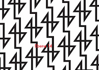
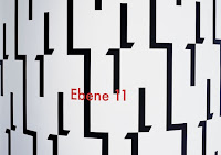
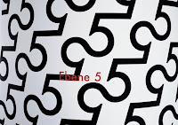
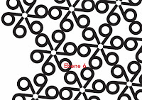
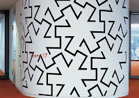
These walls were designed to distinguish each of the 19 floors of the Landesbank Baden-Wurttemberg an German bank and major international business. According to the website, the building's interior is uniform, aside from each floor's different wall pattern, giving a little bit of life into the space.
The font choice is very appropriate for this design because of its geometrical nature, allowing for such patterns to exist in the first place. And each pattern is unique, eliminating any mistaking of what floor it is. Futura also reflects the nature of the business well, as a bank and its employees deal with plenty of numbers and math.
When I first saw these pictures, I didn't realize they were actually numbers. I saw them purely as form. This is an excellent example of how to manipulate type to transform into a completely different visual language. Also a pretty cool example of designing for the environment, making simple, informative signage into something fun and unique, yet appropriate.
Frontage Typeface
Frontage Typeface:
Frontage is a charming layered type system with endless design possibilities using different combinations of fonts and colors. Achieve a realistic 3D effect by adding the shadow font or just use the capital letters of the regular and bold cut for stark artwork.
The typeface's design is based on a simple grid which creates the friendly, handcrafted look of facade signs. It is generously spaced for maximum impact of your message.
As a display typeface Frontage loves color and is suitable for headlines and logotypes. Details include 224 characters in six styles and manually edited kerning.
http://www.behance.net/gallery/Frontage-Typeface-freefont/3292158
I chose this typeface because I really loved the personality it had. I also enjoy the spacing and how the type reads with the shadows, colors, and patterns. I think it is a fun type and can be used on all different types of things. Similar to my other posts this too is a more decorative typeface then what I would typically gravitate to. It's funny that the first two posts I found type that was really decorated and then when looking at this type it is kind of a halfway point between my first few posts and what I usually work with in my designs. I would love to get to use this type on a project or maybe even find a way to get it into my portfolio. Enjoy!
Ridley Scott's Alien
Watched this Sci-fi classic this weekend and there was a lot of great typography that caught my eye. To begin with, the physical DVD cover was intriguing (especially for those who haven't seen the movie), though nothing screams action movie more than Impact or any variety of it...
The next example was the opening title sequence in the movie itself. You get to watch the build a font machine make the title right in front of your eyes! It was pretty unique and added to atmosphere of what was to come in this very light-hearted movie.
The last example is comes from a great tension building scene (and one of the most important ones in the movie) that dealt strictly with type only. After some digging around to find the official name for this particular font, the good folks at Typophile came to the conclusion that it was Berthold City Light, a serif font (http://www.typophile.com/node/60657).
 |
| http://www.top10films.co.uk/img/mother_computer-alien.jpg |
If old computer fonts are your thing then I think Berthold is a great choice. It's kind of got its own niche in terms of functionality and purpose, but it's a legible font with some crisp character. Great movie with some great typefaces, I recommend it if you want to get the font scared out of you... yes, that was a bad joke.
Mapping Out Typography
I've seen this global map here and there whilst browsing online for awhile now and it's always kind of grabbed my attention. I'm not sure where exactly it originated, but you can buy it as a full sized poster from a few different retail sites. I've seen it reused a couple times online in different colors, but from what I gather this tan/sepia map is the original.
The typeface used to form the larger countries in the map is a thick and heavy sans serif, in the smaller ones a lighter typeface is used which is also sans serif. It's probably helvetica, arial or something similar as far as what it's named exactly.
Type isn't used exclusively to form the countries, since many of them have odd shapes that letters wouldn't fit into very legibly. Instead there is a lighter section of the brownish background to differentiate land masses/countries from the oceans. Using such large text to fill the countries is a great idea because viewers don't have to strain to see what country they are looking at. This would be a great map for a teacher to have in their classroom or a good poster for anybody interested in knowing international borders.
Thy typeface that is used is very easy to read from a distance and aids in the overall interesting look of the map/poster. I think that if a serif font were used it would work, but not as well as the thick overall structure of the san serif font used. A serif font would leave a lot more empty space in the countries and they wouldn't appear as solid or unified.
I've always been interested in type being used to form objects and this is kind of a continuation of that interest. However, this one is slightly different in that the shapes of the countries actually cut out some areas of the letters. What I've seen in the past tends keep the whole letterform without cutting into it to form a shape. This map has opened my eyes to the fact that the human brain is capable of reading words that have chunks of letters missing. It just has to be done skillfully so it is still easy to read, such as this map.
Sure Be Cool If You Did
I’m not sure how many country music fans we have among us,
but since this week is an open topic, I thought I would share a little bit with
you all. When searching for songs on YouTube, the majority of the material
consists of about 1,000 different “lyric” videos that simply stream the audio
and run the lyrics on a generic slideshow—zero conceptual points for them! I
came across Blake Shelton’s “Sure Be Cool If You Did” official lyric video,
which adds an exciting twist to normal lyric videos and exerts an emphasis on
typographic design that most others lack. I initially thought it was
interesting due to the fact that very few artists actually put out an “official
lyric video”. They usually leave it up to the amateurs of YouTube that guess at
half of the lyrics and present a video that is, visually, unappealing to look
at.
The typography choices applied to the lyrics help set the
tone for the song and act as a visual enhancement to the settings of each shot.
All of the typefaces have a country or “bar-scene” theme and help to develop
the mood of the song. I appreciate the deviation from the normal, boring lyric
videos and enjoy the complimentary relationship between the visual appearance
of the words and the lyrics they are portraying.
Here are a few highlights from the video:
And here's the link if you're feelin' a little country:
http://www.youtube.com/watch?v=JUX2YIpH0r4
Subscribe to:
Posts (Atom)


.JPG)
.JPG)
.JPG)
.JPG)


